The images I used are either of ‘Vince Fox’ or the final image is of someone else in his band. The first image is a large close up to attract readers if they are flicking through the magazine, I hope it will draw people in. The other two images I placed at the end of the article and are there to make the article look more interesting. Magazines would normally include captions on the photos, these are normally humorous or give more information to the reader. There are not many conventions to a double page spread, but I have tried to follow all of them. The text is in columns and is surrounded by the photos. I have also put quotes from the article in a larger font and placed them within the text. This gives the reader a sample and makes them want to read the whole thing. I have included other smaller things that appear in other magazines such as the page numbers, the title being in a different font and the magazine logo in the top corner.
Final Draft
On my final draft I have changed the layout so there isn't as much text all bunched together. I did this by moving the images. I have included a new image of my subject which still reflects the style of my article. Finally I made the title bigger so it stands out more and added a subtitle to make it seem as if the article is a weekly feature.
I have followed the normal conventions of a contents page. It contains an editorial, a list of contents in numerical order and accompanying images. Sticking to these conventions make my contents page look more professional. Even though the contents are organised that are organised all over the page which gives a sense of chaos which I think reflects the feeling of my genre. I have used the same fonts and colours as my front cover, so there is consistency throughout my magazine. The font and colours reflect the genre of my magazine. The font is always in capitals, which suggest that it should be said loudly, and some of the letters seem to be distorted which connote noise. The colours I chose are ones that are normally associated with modern rock. The red had connotations of danger and excitement, on the title for the feature article the red is used to represent blood which is explained in the article. The grey is darker and makes the red stand out more on a shelf. I have used the same colours throughout so there is consistency and a house style. I have arranged my images around the text so that they frame the contents and draw attention to the lists. The three images are related to one article from each section of contents. Each of these images has been manipulated so improve the lighting or background. In the first I have photo shopped a photo of blue sky behind the stage at Leeds festival. Overall this brightened the image. On the other two I have superimposed the subjects on to more interesting backgrounds, this makes them more related to my genre.
Final Draft After audience feedback I have changed a few aspects of my contents page, first of all i have split up the contents and images using incomplete boxes, this makes it look neater and overall splits up the large amount of grey. I also made the editorial bolder so it stands out more at the top of the page.
When I was choosing the fonts for my front cover I wanted a style that would represent the themes of my magazine. After experimenting with fonts I decided on Mister Sirloin Bt Rare The font is always in capitals, which suggests that it should be said loudly, and some of the letters seem to be distorted which connotes noise. Vince Fox is written in Dragline which looks sketchy and hand drawn, I think this works well with the article as it is about the artist being personal. The O in Fox is actually a graphic that represents a circle of blood along with the splash at the end. The colours I chose are ones that are normally associated with modern rock. The red had connotations of danger and excitement, on the title for the feature article the red is used to represent blood which is explained in the article. The grey is darker and makes the red stand out more on a shelf. I have used the same colours throughout so there is consistency and a house style. The image is of the single artist “Vince Fox” normally on the front cover of a magazine the subject in the main image would be looking at the camera but I have broken this convention to make the image relevant to the article. The article is about the artist’s deep thoughts and revealing secrets or things he has never told before. To portray this, the subject is looking away from the camera into the distance as if he is in deep thought. The image is large so the magazine stands out on a shelf and the face of the subject is framed by the other images and subheadings. The other two images are connected to and article about guitarists so obviously had to contain guitars. At fist the images were too bright and didn’t look right on the dark cover, so I lowered the saturation of them, so the colours were less bright, they compliment the overall effect of the dark cover. To make my front cover look as professional as possible I have tried to stick to the conventions that magazines usually follow. The main things most magazines usually follow are, the masthead at the top with a large image taking up most of the page underneath, and surrounding subheadings that give information about the contents of the magazine. All of these aspects should reflect the tone and theme of the magazine and are all used to draw the reader in, and to make it stand out on a shelf next to other magazines. I have followed these conventions and as a result the cover looks professional. The only convention I broke was the subject not looking at the camera but I merely twisted this convention to make it fit round my article.
After my audience feed back I discovered that some of my images needed to be improved, the two points that needed improved was some images were too bright and didn't fit in with the overall style of the magazine or the backgrounds to the images were boring and didn't reflect the style I wanted. To manipulate my images I used Photo shop CS4.
This original image was too bright and the colours were too natural, when placed on the front cover it stuck out too much, as the background was dark. So to improve the image I started by lowering the saturation so making the colours less bright, this turned the dark blue to black and made the dark edge around his guitar thicker. I think this fits in with my style and makes the guitarist look more like a rock singer rather than a folk singer. The picture still didn't look right on my front cover so I removed the background and left it blank. This made it look much more like a photo shoot rather than a man on the street.
On this image I had the same problems, it was on the front cover but was too bright. The main problem was the bright light coming from the left of the image. Again I lowered the saturation so the light was less bright, this made the image darker and overall look more sinister.
I didn't like the background of this picture as it contains my wardrobe and a large shadow so I changed it. At first I made the background plain white but decided this was quite boring and wanted to make it look like it wasn't taken in a bedroom. To do this I erased the background and inserted another layer, this layer was an image of a street, this makes the image more realistic and maybe as if she has been playing on the street. Other artists who have been busking to become famous may relate to this. Once I had inserted this into my magazine I asked for more audience feed back. And I was told that even though it looks good the image still looks manipulated so I kept it as it is but suggested that it is meant to be fake by captioning the image with, "Rose Starr, goes back to the 'streets' "
This image had the opposite problems to the other images, it was too dull and contained to much grey sky. To start I increased the saturation to sharpen the colours, I thought this made the picture look sunnier but the sky was still grey. To solve this I erased the grey sky and pasted in a blue sky. At first the image contained three aspects of Leeds festival. The stage showed the music, the crowd showed the people and the ground showed the mess. But not after manipulating the image I have added the sunshine into the connotations.
In this photo the subject is looking off into the distance as if thinking about something, which is backed up by the subtitle "We delve into the mind of rock's deepest front man". The photo suggests that he is about to reveal something and has connotations of regret and secrets. I chose this subject as he reflects the emo image which the article is appealing to, he is also wearing his normal clothes, nothing fancy so that normal people can relate to him. Finally the picture is bright but contains plain colours so that the photo isn't too bright and spoils the style of my front cover.The photo also breaks the convention of the rule of thirds as the subject of the photo is in the left of the picture, this suggests he is rebellious and doesn't play by any rules, which is what I want to put across the image. Another convention that it breaks is that the subject isn't looking at the camera, again this suggests attitude but also is releted to the title of the article, it looks as if he is deep in thought.
These are the two photos that I used on my Double page spread, One looks like he is deep in thought and the other looks like he has gotten something off his chest. The first image is mainly an introduction to the article with the subject looking happy and the other is more of an insite into the character of the subject.
These are the manipulated photos I used on the contents page. The first is of the stage at Leeds festival, I have included three layers in the picture which I think describe Leeds fest perfectly, The stage for the music, the crowd for all the people and the ground to show the mess that is made. To star the image was quite dull so I changed the brightness and Photo shopped a blue sky in the background to brighten the image even more. The second is of "Rose Starr" I tried to make the subject look more of a musician by have the guitar, hat and glasses, and standing with her hands behind her back is if to say " yeah I like making NOISE, what you gonna do about it?" and finally super imposed her onto a back ground to make her look more street. The third image is of the singer of Enter Shikari who I met at a signing. If the readers know the band they would instantly know who he was, i think this adds more variety, by having real artists rather then models.
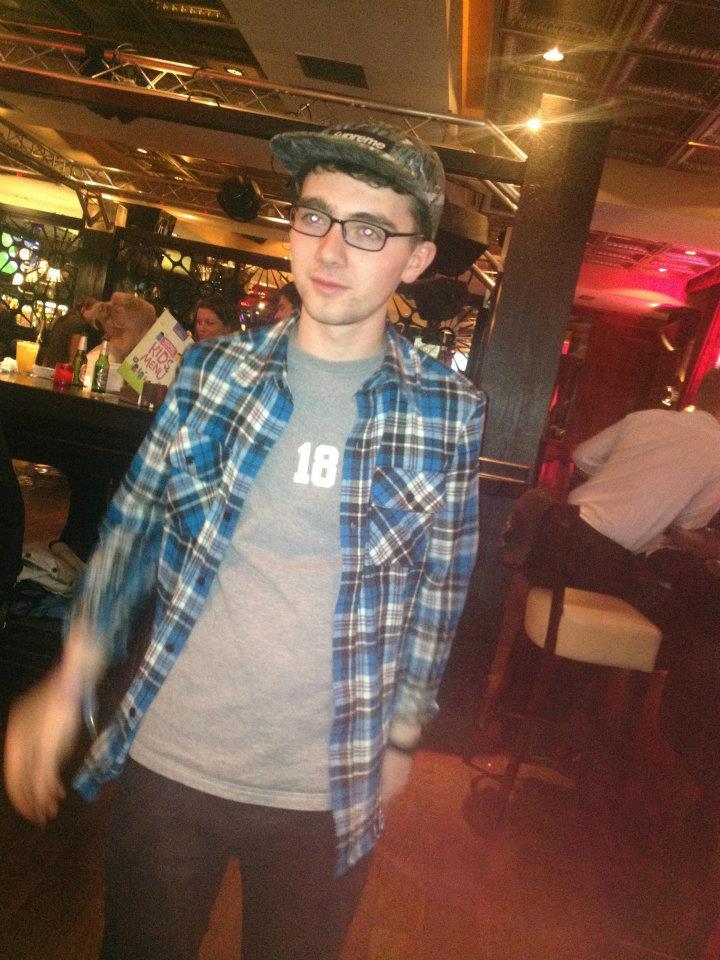
These last two images were used on the front cover as part of a 50 greatest guitarists feature. Neither of them were planned and were taken spontaneously. The first is of a busker on the street and I caught him mid strum while performing a song. I think this adds an element of action into the image. I also think he looks very stylish and reflects the Rock n roll image with his plaid shirt and fedora. Originally his shirt was too bright and didn't look right on the cover so I lowered the saturation. The other is of my friend who I caught mid head bang while playing guitar, his swinging hair and the shiny Les Paul reflects metal style perfectly and looks brilliant on my front cover. There was a lot of light coming from the left side of the image so I lowered the exposure and saturation to improve the photo.
Photos That I Couldn't Use These photos were taken of the stage at Leeds Festival, they would not be good in the magazine for many reasons. First of all it is impossible to tell what band were playing at the time as I was too far away from the stage and the stage is very large and dark in the image. The other problem that the crowd becomes the main focus of the picture, even though I tried to take it over the crowd line there is still a lot of people in the bottom of the image. The stage is also obscured by their hands and head. This photo would be on the contents page instead of the other Leeds Fest photo, it is meant to show the large field of tents in the campsite. The photo shows a large part of what leeds fest is about, the thousands of campers and tents. But the photo is not clear enough at all, the image would be reasonably small on the page and the tents would be unclear and all the colors blur together. In this photo the subject was meant to be casually leaning up against the wall but he ended up looking awkward with weird smile and his arms crossed. Over all the photo doesn't reflect the style that he is meant to represent. He is meant to be "cool" and act casual like he doesn't care if people are watching him. So this photo wouldn't work in my article or anywhere else in the magazine.
In this photo the subject should've been showing attitude which he found hard and turned more into him just looking a annoyed at the camera rather than angry at society and the labels it places upon him.
This is the first layout I have created. The dark blue and grey look good together, and the plain grey makes the blue stand out more. I have put the mashead in a banner to make it stand out against the main image, I have also made it so the masthead is disappearing into the distance. No magazines do this at the moment, it could look good but may make the masthead harder to read when it is on a shelf in the shop. On the right alighn there are images with accompanying text to give more information about the content of the magazine. Along with the texr for the feature article the images will frame the main image. because of the banners at the top and side there is a lot of room for the main image, and hopefully it won't be obscured by too much text.
This layout is quite different to the first. The masthead is put into the corner so it doesn't obscure the image, this could mean it is too small and hard to read, but magazines like NME have the mast head in the corner and it is still a successful, popular magazine.The rest of the subtitles are in the top right corner, again this is so that no text is obscuring the image. The only text over the image will be the title of the feature article. There is also a boost at the bottom that will contain more information, while still not obscuring the image. I have chosen red and grey because my research showed they are prefferred colours, also they reflect the theme of my magazine. The grey may be dull but the red is bright and stands out even more next to the dark grey My final layout is meant to be as simple as possible, there is no boxes and only one large image that covers the whole page. The masthead is clear and bold at the top and the image underneath will be large and will hopefully stand out on a shelf. The subheadings on the right align will overlap the image but hopefully won't obscure it too much. The boosts at top and bottom will provide and extra information that doesn't fit in the subheadings.
Contents This is a simple layout for a contents page and is very similar to contents pages in lot of other music magazine such as Q. It follows the conventions of contents pages in that it has the title at the top, room for a editoria and lots of space for a list of contents. There is also 3 large images that would correspond to three different articles.
This grid is similar to the contents page in older Kerrang magazine, the combination of text and images in the grid give a chaotic feel which would put across the idea of noise and rock music. The only problem with this would that because there is so many images there wouldn't be much information about the contents.
This is my favourite of my drafts, and will be the one I use for my final product. The layout means there is a sense of chaos like I mentioned on the other draft but not because of the arrangement of the images there is much more room for the contents. Because there is only three large images i will have to choose photos that will grab the readers attention and encourage them to keep reading.
Rock music is a genre of popular music that became popular in the 1960s. It started with 1940s and 1950s rock and roll, rhythm and blues, country music and also drew on folk music, jazz and classical music. The sound of rock often revolves around the guitar back beat laid down by a rhythm section of electric bass guitar, drums, and keyboard instruments such as organ, piano, or, more modern, synthesizers. Along with the guitar or keyboards used as soloing instruments. In its "purest form", it "has three chords, a strong, insistent back beat, and a catchy melody." In the late 1960s and early 1970s, rock music developed different subgenres. When it was blended with folk music it created folk rock, with blues to create blues-rock and with jazz, to create jazz-rock fusion. In the 1970s, rock incorporated influences from soul, funk, and Latin music. Also in the 1970s, rock developed a number of subgenres, such as soft rock, glam rock, heavy metal, hard rock, progressive rock, and punk rock. Rock subgenres that emerged in the 1980s included new wave, hardcore punk and alternative rock. In the 1990s, rock subgenres included grunge, Britpop, indie rock, and nu metal I will try to include as many subgenres in my magazine so it appeals to a wider range of people. A group of musicians specializing in rock music is called a rock band or rock group. Many rock groups consist of an electric guitarist, lead singer, bass guitarist, and a drummer, forming a quartet. Some groups omit one or more of these roles or utilize a lead singer who plays an instrument while singing, sometimes forming a trio or duo; others include additional musicians such as one or two rhythm guitarists or a keyboardist.My magazine will reflect the common style of rock music and will be noticable as a rock magazine.
For the preliminary task we had to produce the front and contents page of a school magazine, using a desktop publisher and image manipulation software. It had to include a photograph of a student in medium close and some appropriate text and a masthead.
I wanted to aim the magazine at a wide audience and make it appropriate for the whole school so I had to use a style that would appeal to all ages. Therefore I made it very simplistic, using simple shapes and fonts and made everything stand out with simple colours. But it would also have to look smart and professional to appeal to parents of the students, I made sure this was shown on the front page and contents page to show cohesion. I called it HGS News as the magazine contains news and information about the school.
The first thing I did was take the photos, so I could build the magazine around the images. I manipulated the photos I took on Adobe Photoshop CS to brighten them and remove and smudges or marks on them. When I had the images I could make up articles to accompany them, for example the photo of the student in the gate goes with an article about the gate, this would mainly appeal to sixth formers, but the quality of the image would make the cover look more professional. Once the images and text were on the page the next thing to do is create a suitable background. To do this I used simple shapes to frame the images and text. The white borders I used stand out against the red and the gradient on the contents makes the background more exciting than just plain red. This is simple but effective and means the background doesn’t draw attention from the text.
I am very happy with how the front page turned out. The images used look good especially because of how I edited them, for example I darkened one section of the main image so the text could be read. The simple layout makes it easy to read and understand. There is just enough information so that the page is not cluttered. Plus the masthead has a different font to the subheadings which makes it stand out more. One of the problems with the front page is the name, I could not think of an appropriate name so I went for the obvious and quite boring HGS news. I like the layout of the contents page but I don’t like the large white box that surrounds the contents. I don’t think it really fits in with the front cover, so there is not much cohesion. Also the star at the bottom was just added to take up space, and I don’t think it looks very good.
Overall I think my front cover turned out very good all the images and text are aligned so it looks professional, and I think it would appeal to my target audience. T he contents page could do with more work, I didn’t spend quite as much time on this and probably made some wrong choices. As I went through the process I learnt how to use Photoshop affectively and to achieve the best results and that editing images can be hard and is much easier if you are familiar with the software. I also learnt a lot about Microsoft Office Publisher and how to produce publications that look professional, one problem that arose with publisher was the white borders it automatically left, this meant I had to trim it down which meant the magazine was no longer A4. If I did this again I would learn how to get past such problems so my end product would look better and more professional.
I will create the front page, contents page and a double page spread of a music magazine. The magazine will be called ’Noise’ and will be aimed at eighteen to thirty year olds, as through research I have found out this age group are mostly likely to buy music magazines. The magazine will focus on the genre of modern rock, this means I can cover the such sub genres as punk, alternative, indy, emo and metal. Hopefully this would attract a larger audience. To make my magazine more recognisable I will stick to a house style. This means I will use the same fonts, colours and general layout through out the magazine. I will use a plain and easy to read font for the main bodies of text but will use a bolder font on headings to make them stand out. The main colours I will use are red, grey and some Black. These colours go well together and are related to the theme of rock music, and have been used before in music magazines and other music related products. The magazine will be released weekly at the competitive price of £2. I think having it at this price would attract more customers. The front page will include a masthead, feature article, and various other subheadings. The front page is the most important as it is the first thing people see on the self. The contents will contain a list of the articles with accompanying images. And finally the double page spread will include an article with images, it will most likely be an interview which I will write myself. After researching audience theory I have realised that using lures would make more people buy the magazine, such as an exclusive with the first magazine, this could mean including a free CD. Another way to attract even more people to the magazine and make it more memorable would be to twist conventions a little bit. Overall using these simple ideas I plan to make a professional looking front page etc that could be made into a real magazine.
From my research I have found out what would make my magazine stand out on a shelf and what would attract people to it. Using the questionnaire I have found out that one of the most popular magazines is KERRANG! Which focuses on Rock and Metal music therefore this may be a good path to follow. But there was an obvious difference between what different age groups preferred, the younger range preferred KERRANG or NME whereas the older range went for Q, I will have to take this into account when think about the audience of my magazine. The majority of the people I asked would buy a magazine because or the artist on the front, especially if it’s a full band shot, but there were some people who were drawn in by the article inside rather than the image. Audience theory is also important to take into account. Including a free gift seemed popular, the most popular being a CD or a poster, most magazines always have posters in the middle and include CDs occasionally. One of the most important questions was the name, after analysing the results I have found out the most popular name is Noise. It makes people think of music and sounds loud and exciting. Finally people think the best colours to use would be Red, Black and some Grey, as they think it would look good and stand out on a shelf.
Layout – Mojo also sticks to the conventions of most magazines with the masthead at the top, a large main image of the feature article and subheadings surrounding it. One way it twists conventions is the image covers a large part of the masthead, this means the magazine would have to be well known to be recognised on a shop shelf. All the text frames the image so the reader focuses on the band as they should be the main focus. Also there is a boost at the top which gives more information.
Image – The feature article is about Queen so the cover image is of the whole band on a black background, the subheading says ‘the second coming’ which sounds serious so the band are looking seriously at the camera. Freddy mercury is at the front of the image with his iconic facial hair as he is the most recognisable member of the band, and it shows he is the lead singer. The image doesn’t show that the magazine is a music magazine but most people know that Queen are a band and would be recognised as a music magazine.
Font Style – The masthead font is plain and white but stands out against the black background. This suggests that the magazine is meant to be mature and professional and would attract an older audience. The font on the feature article looks quite modern which shows the magazine is trying to be up to date, this also ties in with ‘The Second Coming’.
Audience – The cover of Mojo would suggest the magazine is aimed at a old audience as it is simple and professional looking, and doesn’t have any features that would appeal to a young audience. Also most of the bands on the cover appeal to an older audience.
Contents Page
The contents page for Mojo is split over two pages, with the feature articles on the first page and the rest on the next. Having the contents split this way means that more attention is drawn to the feature articles and that the writers think that the features are the most important. On the feature page there is an images related to one of the articles with a quote from the article. This highlights a certain article and makes the reader want to continue reading. On the other contents page the contents are right aligned and split into three sections instead of numerical order, this might suggest that Mojo try to be different to other music magazines. On the left align there is images related to certain articles the images show more about the stories and draw attention to certain reviews or articles. Another thing included on the contents page is a small section at the bottom about some of the main writers in this issue, this reveals more about the magazine and the people behind it.
Double Page Spread
The double page spread in Mojo is quite plain compared to KERRANG! Rather than an interview it is a long story about Queen, so instead of being set out with a question then an answer it is set out all over the page like a conventional magazine article, with images around and in the main body of the text. Overall the page is quite plain which suggests the magazine is still trying to look professional and clear. This as well as the large amounts of texts suggests it is aimed at people who are more interested in reading about the band rather than looking at pictures.
Layout – The layout of KERRANG! sticks to the conventions of most magazines, the mast head is at the top of a page with an image underneath with the subheadings surrounding it. The cover also contains a boost at the top and bottom of the cover to display more information about what’s inside the magazines. The large image for the feature article would make the cover stand out on a shelf, which is important as it would be surrounded by lots of other magazines. All the space is used, this may be to make to the cover crowded and visually ‘noisy’ which represents loud rock music.
Image – The feature article is an interview with Slash from Guns ‘n’ Roses so he is in the main image on the cover. The image does not show his whole face but includes his iconic glasses, top hat and hair. Because these items are included the picture doesn’t have to show the whole of him as people will recognise him anyway. The way he is posing for the shot is also related to the article, the subheading reads: Slash the x-rated confessions of a guitar god! The way he is posing while tipping his hat looks as if he is confessing, or revealing something, which then becomes apparent in the interview.
Font Style – The masthead of KERRANG! is originally writing in a bold plain font to make it stand out, but white lines are added and some areas of the text are ‘worn’ to make the masthead look shattered or broken. As KERRANG! refers to the sound an electric guitar makes this could mean that the words have been shattered by a lout noise. It could also mean that it has been smashed by a guitarist being very Rock ‘n’ Roll and smashing it with a guitar. The titles for the subheadings are all bold and either in white or yellow to stand out against the black or red. The rest of the text has the same worn effect that the masthead has the same worn effect as the masthead which could also suggest the rock n roll lifestyle.
Brand Identity – One of the main things that makes KERRANG! recognisable is the smashed font that is used in the masthead. But another important part of the title is the exclamation mark. This shows that the sound is meant to be LOUD and suggests that the music in the magazine is loud too. The exclamation is repeated all over the front cover, in subheadings and in the boost. The strap line for KERRANG! is ‘Life Is Loud’ this suggests that everything about this magazine is loud and exciting. Also the colours used on the cover have rock music connotations, red and black is usually associated with rock music and yellow and black normally mean danger.
Audience – The use of the work X-rated on the cover would suggest that the magazine is not suitable for some ages, this is backed up by the parental advisory logo. Also even though KERRANG! does feature bands that would appeal to all ages the cover focuses on Slash and bands such as Metallica which some younger readers might not have heard of. The colours used are quite simple which doesn’t put across sophistication and may suggest the magazine is aimed at a younger audience.
Contents Page
On the contents page the page numbers for the most interesting articles are set out in a grid with accompanying images so the reader can have a quick insight to the article before reading it as it could show what the article is about. There is one article that has a bigger image than the rest, which would suggest it is more important, interesting or even better that the rest. The images are either taken during a live show or a band/person posing for photo shoots. The live images look much more natural but the posed pictures show the character of the subject. The rest of the articles are aligned on the right in order and spit into different sections, such as news, reviews and gigs. The colours and fonts used have been carried on from the front cover, which shows they are part of KERRANG!s identity. The colours make the text stand out and the yellow and black connote danger. The contents page also has an editorial which reveals more about the feature article. This and other subheadings encourage people to read all the articles instead of skimming the whole magazine.
Double Page Spread
The double page spread is an article with slash and is mainly about the dark side of the rock n roll life style. This is represented by the dark background and images, which shows the interviewer is going very deep into the dark parts of Slash’s life. There is lots of text on one side and a large image on the other, the text is very small which suggests Slash has a lot to talk about. The questions and answers are written in different colours so the reader knows who is talking and overall makes it a lot easier to follow. Certain parts of the interview is quoted around the image, with words like overdosed and died highlighted, this shows the interesting or shocking parts of the interview so if someone saw the quote they would want to read the whole interview. The images contain his iconic accessories and look as if the could have been taken during the interview.
The Bauer Media Group is a large German publishing company based in Hamburg, which operates in 15 countries worldwide. Since the company was founded in 1875, it has been privately-owned and under management by the Bauer family. It was formerly called Heinrich Bauer Verlag KG, abbreviated to HBV and usually shortened to H. Bauer. It produces and distributes many popular magazines and has stakes in television and radio, recently completing the purchase of a consumer magazine division and radio station division of the British company, EMAP. Worldwide circulation of Bauer Media Group's magazine titles amount to 38 million magazines a week. A lage distribution group like Bauer would be a good one to choose for my magazine as It distrbutes Music magazines of similar genre to mine.
Kerrang was first printed as a supplement in Sounds magazine on the sixth of June 1981, and is now published by Bauer Consumer Media. AC/DC were on the very first front cover and throughout the eighties Kerrang featured many thrash, glam and metal bands including Motley Crue, Bon Jovi, and Metallica. But when Nirvana started to get big Kerrang started to put grunge bands on their covers. This happens every time there is a new music trend, in my magazine I will try to include artists from a currant popular genre as this will attract more readers. The most successful period was from 2000 onwards when Nu Metal was big, and Paul Rees was the editor. Paul Rees moved to Q and Ashley Bird took over, unfortunately Nu Metal declined at this time and so did Kerrang! sales and he was fired. The most obvious thing to change about Kerrang is the cover. Over the years the amount of text on the page has changed and in later years more images were added. The mast head also changed from big to small to big again, and the current cover has removed the white band and the subheading. Another feature included in the magazine is the comic strip ‘Pandora’ I may try to include a similar feature in my magazine.
Q Magazine was first published in 1986 by the Bauer Media Group, and has been released every month since. The magazine was originally going to be called Cue, as in to cue a record, but the editor didn’t want people to think it was a snooker magazine. So they thought that Q would look better and stand out on a shelf. The magazine used to have the subtitle ‘the modern guide to music and more’ this has changed lots including ‘The essential music guide’ and ‘The UK’s biggest music magazine’. There is also a message on the spine of the magazine that is related to one of the articles, this has become a memorable feature of Q. Promotional gifts are often given way, these gifts are almost always CDs In my magazine I will include a free gift or something similar such as a competition. The appearance has changed quite a bit over time, but has still kept some similar aspects, such as the red square and the font used on the Q. I will try have aspects of my magazine that are just as recognisable as the Q logo Currently the magazine has circulation of 130, 179.


