
I have followed the normal conventions of a contents page. It contains an editorial, a list of contents in numerical order and accompanying images. Sticking to these conventions make my contents page look more professional. Even though the contents are organised that are organised all over the page which gives a sense of chaos which I think reflects the feeling of my genre.
I have used the same fonts and colours as my front cover, so there is consistency throughout my magazine. The font and colours reflect the genre of my magazine. The font is always in capitals, which suggest that it should be said loudly, and some of the letters seem to be distorted which connote noise. The colours I chose are ones that are normally associated with modern rock. The red had connotations of danger and excitement, on the title for the feature article the red is used to represent blood which is explained in the article. The grey is darker and makes the red stand out more on a shelf. I have used the same colours throughout so there is consistency and a house style.
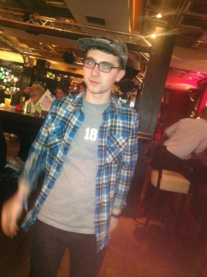
I have arranged my images around the text so that they frame the contents and draw attention to the lists. The three images are related to one article from each section of contents. Each of these images has been manipulated so improve the lighting or background. In the first I have photo shopped a photo of blue sky behind the stage at Leeds festival. Overall this brightened the image. On the other two I have superimposed the subjects on to more interesting backgrounds, this makes them more related to my genre.
Final Draft
After audience feedback I have changed a few aspects of my contents page, first of all i have split up the contents and images using incomplete boxes, this makes it look neater and overall splits up the large amount of grey. I also made the editorial bolder so it stands out more at the top of the page.

No comments:
Post a Comment