
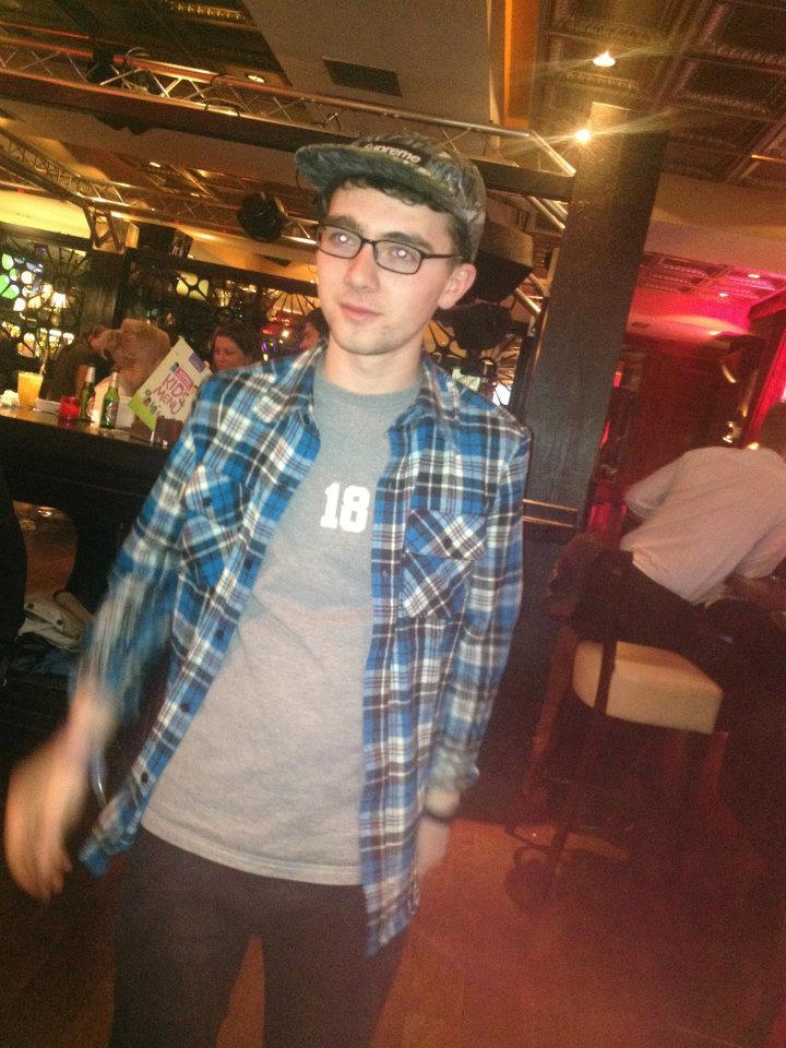
The images I used are either of ‘Vince Fox’ or the final image is of someone else in his band. The first image is a large close up to attract readers if they are flicking through the magazine, I hope it will draw people in. The other two images I placed at the end of the article and are there to make the article look more interesting. Magazines would normally include captions on the photos, these are normally humorous or give more information to the reader. There are not many conventions to a double page spread, but I have tried to follow all of them. The text is in columns and is surrounded by the photos. I have also put quotes from the article in a larger font and placed them within the text. This gives the reader a sample and makes them want to read the whole thing. I have included other smaller things that appear in other magazines such as the page numbers, the title being in a different font and the magazine logo in the top corner.
Final Draft
On my final draft I have changed the layout so there isn't as much text all bunched together. I did this by moving the images. I have included a new image of my subject which still reflects the style of my article. Finally I made the title bigger so it stands out more and added a subtitle to make it seem as if the article is a weekly feature.

This comment has been removed by a blog administrator.
ReplyDelete