
This is the first layout I have created. The dark blue and grey look good together, and the plain grey makes the blue stand out more. I have put the mashead in a banner to make it stand out against the main image, I have also made it so the masthead is disappearing into the distance. No magazines do this at the moment, it could look good but may make the masthead harder to read when it is on a shelf in the shop. On the right alighn there are images with accompanying text to give more information about the content of the magazine. Along with the texr for the feature article the images will frame the main image. because of the banners at the top and side there is a lot of room for the main image, and hopefully it won't be obscured by too much text.

This layout is quite different to the first. The masthead is put into the corner so it doesn't obscure the image, this could mean it is too small and hard to read, but magazines like NME have the mast head in the corner and it is still a successful, popular magazine.The rest of the subtitles are in the top right corner, again this is so that no text is obscuring the image. The only text over the image will be the title of the feature article. There is also a boost at the bottom that will contain more information, while still not obscuring the image. I have chosen red and grey because my research showed they are prefferred colours, also they reflect the theme of my magazine. The grey may be dull but the red is bright and stands out even more next to the dark grey

My final layout is meant to be as simple as possible, there is no boxes and only one large image that covers the whole page. The masthead is clear and bold at the top and the image underneath will be large and will hopefully stand out on a shelf. The subheadings on the right align will overlap the image but hopefully won't obscure it too much. The boosts at top and bottom will provide and extra information that doesn't fit in the subheadings.
Contents

This is a simple layout for a contents page and is very similar to contents pages in lot of other music magazine such as Q. It follows the conventions of contents pages in that it has the title at the top, room for a editoria and lots of space for a list of contents. There is also 3 large images that would correspond to three different articles.

This is a simple layout for a contents page and is very similar to contents pages in lot of other music magazine such as Q. It follows the conventions of contents pages in that it has the title at the top, room for a editoria and lots of space for a list of contents. There is also 3 large images that would correspond to three different articles.

This grid is similar to the contents page in older Kerrang magazine, the combination of text and images in the grid give a chaotic feel which would put across the idea of noise and rock music. The only problem with this would that because there is so many images there wouldn't be much information about the contents.

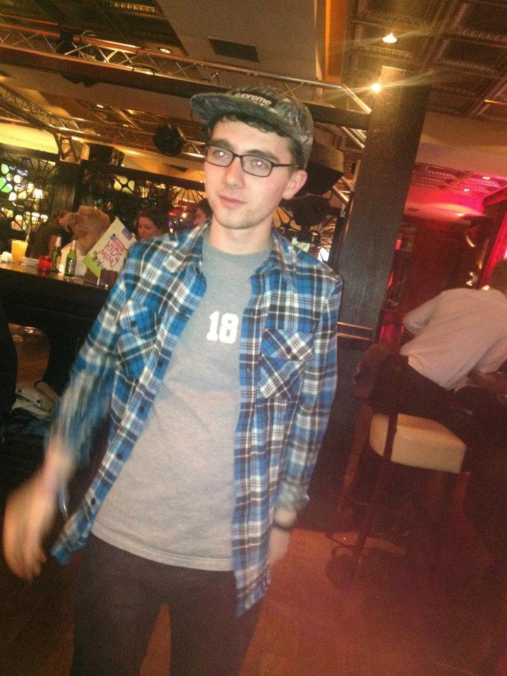
This is my favourite of my drafts, and will be the one I use for my final product. The layout means there is a sense of chaos like I mentioned on the other draft but not because of the arrangement of the images there is much more room for the contents. Because there is only three large images i will have to choose photos that will grab the readers attention and encourage them to keep reading.
No comments:
Post a Comment